Porcelain Raft - Put Me To Sleep
Friday 27 January 2012
Album artwork: The Sex Pistols

The Sex Pistols album ‘Some Products Carri On’ 1979 is a bold and distinct album
cover. Such like their other ones,
bright pink and yellow are used which creates a style and expectations for the
audience. The bright pink and yellow is a sign of rebellion and is also a way
to stand out. The Sex Pistol use these feminine colours in a way that creates a
whole new reputation for them, making them hard, disobedient colours that also almost
define the punk generation. The
items used in the album cover are definitive of the members. To the right is a
magazine cut out image of Sid Vicious with a swastika top on, to the bottom is
a chocolate bar with ‘ration bar’ writing in their iconic font, along with a
small burger, sweeties and a doll of Sid in a coffin. To the left are beer
bottles, popcorn and an image of a woman with a punk haircut and a doll replica
of her. Possibly Nancy? Sid’s girlfriend.
These concoctions of images form and interesting album cover
that allows audiences to look at it over and over again, uncovering more
information and the artist. Furth more, as a spoken interview album these
images could in some way relate to the dialogue.
To continue, the album name relates a lot to British culture.
The word ‘carry on’ (spelt carri) is a reference to the British Carry on films
that were widely popular and often-showed nudity. While the spelling of ‘carry
on’ is as ‘carri on’ is pun on the work ‘carrion’ which is from the Latin
"caro", meaning "meat", referring to carcass (dead
animals). This linked with the mages could imply that all the products that are
shown are nothing but carcasses and products for scavengers (people) to feed
off… beer, chocolate, dolls/ celebrities.
Compared to other albums of 1979 the Sex Pistols album cover
shows a move from natural to unnatural colours. Rickie Lee Jones album still
uses warm, natural browns and oranges that reflect the laidback culture of the
60’s hippie era and beatniks. While The B-52’s album show a contrast and, like
the Sex Pistols a progression into bright and a neon era.


Digipack work
We have begun to work into creating our digi pack. This is
the album artwork and information that would be provided when buying the album
in store or online. We have taken about 40 or so pictures of the artist (me) in
the art department dark room, this is because it is designed for photography
and allows us to capture a better quality of photographs because of the special
lights. We used a range of angles and closeness so we can work with the images
in different ways. I have thought of ways we can manipulate the images to
create a more interesting cover. For instance one of my favourite websites is www.boooooom.com, it showcases a range of
work from artist, photographer and filmmakers and is updated everyday 24/7. I
find it a great source of inspiration and also a great way to see what is out
there (… the competition). A particular artist used both photography and dry
media to create interesting images. He took photographs of i.e. a face and then
manipulated it by drawing over or using Photoshop to make the face look as if
it was cut in half, and what was inside were mechanical wires. We can take this
idea and develop it into something that can wow the views. For instance change
wires into flowers or go one step further and use that idea and change my image
into a gradual metamorphosis into a cat or robot…
Another idea, which we were able to draft in a short time,
was to use Photoshop and layer over three images that are similar but not the
same, so that we can imitate movement.Here are a few of the photographs that we took, these in particular I believe are the best out of the whole lot that we took.
In addition to these photos we still need to take a lot more and in different locations and think about photographs that do not include the artist as to point of focus.


Friday 20 January 2012
Planning for the digipack
For our initial planning for the digipack
we looked at a range of websites that offered a variety of album artwork and
photographs from magazines and fashion photography that we can use. We looked
at thefly.com, wonderland.com iD.com and boooooom.com.
From thefly.com we found four album covers
that we have liked and want to take inspiration from.
New Look “new look”

Neon Indian “Era Extrana”

Summer Camp

Big Deal “Lights out”

We have decided to use lights as a theme
for our digipack because we have played with lights and shadows in the music
video. We want to keep a running theme thought out the whole image the album,
artist and music video.
Tuesday 10 January 2012
Day four of filming
On Saturday the 7th we all went up to Embankment where
we filmed all the shots from south bank and on the bridge. We met at about 2.30
and worked until it got too dark for us to keep continuity levels at a
realistic level. We found the whole day very productive and by the end of the
day we all huddled into Starbucks where we warmed up with a hot drink. However
while filming we ran into some problems. Initially I found it hard to remember
the lyrics to the song, but we overcame this by writing the lyrics on paper so I
could deviously read off them while looking at the camera. But the fates we
having none of it and while filming on the bridge the pieces paper flew out of
Alamaz’s hands into the Thames where they shall rest forever. Secondly, while
filming the shots where I remained stationary while people walk past me, the
public found it very hard to not look at the camera or back at us filming which
was very frustrating to witness. Nevertheless, the whole day of filming was great.
We had fun, got school work done and had some MORE Starbucks!
We are now up to a point of filming where we believe that we
should focus on editing what we already have, which is about 5 hours’ worth of film.
Once we have edited to a good enough stage of work that we can do the initial
showcase we will continue filming the remaining locations, and if needed
revisit the old ones to see if we can capture anything else that could work
well.


Day three of filming
Thursday the 5th Iva and I went to her house
where we filmed more of the music video; here we were able to film the mirror
shots and the ones where I am laying on the bed. We spent about a good two
hours filming from a range of different angles and while we were at it creating
up new ones to see if they would work later on in the editing process. We took
advantage of the location change and made a costume change too. These three
different days of filming amounted to us completing the three costume changes
task, we used a range of different clothing which allowed us to make our music
video when it’s final look fresh and helps to keeps people’s attention.


Monday 2 January 2012
Analysis of a music artist’s website: Gorillaz Plastic Beach Website
The Website created in conjunction to the release of
Gorillaz album ‘Plastic Beach’ is one to admire. Unlike any other I’ve ever
seen, I’ve been able to sit investigating new places for hours and not get
bored in the slightest. The pixelate world that they have created really
embodies the all over feel of the band. This alternate world you buy into when
you download their music is so finely tunes over the years that the 2D character’s
actually become real, and as you explore further into the ‘game’ you feel as if
you’ve uncovered a new scandalous headline about your favourite artist that no
one else knows about. The Website is set up as an island or rather a plastic
beach, you are a charater however it is played in first person so you are
unaware of your image. As you approach the island you are able to interact with
just about anything, uncovering band artwork, fun little games, listen to music,
talk to band members, find tour dates, download songs and such. But what I most
fun of all is the ability to change your path as the character, uncovering secrets
treasure such as you would in a proper game and unlock doors with the right equipment.
Plastic Beach the website still retains all the features of a normal
promotional band website. You can find all the information that you need but
with a lot more to offer. After about a good few hours on the website I am sad
to admit that I still haven’t seen everything! There are doors I am still
unable to open and objects I need to find in order to uncover the mystery of
Noodle (bass guitarist)… I would give this website 5/5 however only that it
would load pages a bit faster.


Self-Marketing of FATM
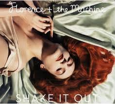

Florence and the Machine released their first studio album
in 2009 under the title ‘Lungs’. ‘Lungs’ held the number two position In the UK
charts for 5 weeks, then after 28 weeks in the charts it reached the top on the
17 January 2010. In 2011 their second album ‘Ceremonials’ was released with
positive feedback, debuting at the top in the UK charts and number 6 in the US.
As technology has developed and technical convergence of equipment
makes it a little bit easier for average Joe to make his own music video and
become a star. Artist need to push a little harder to stay in the spot light so
that little Rebecca Black won’t take their place as the headliner of a music
festival and win ‘Woman of the Year’. Florence Welch in her own right is a brilliant
performer and artist however I find it hard to believe that her image is wholly
organic and the moves she makes are just her ‘everyday endeavours’ and not
promotional techniques. As the lead singer Florence Welch will naturally take
the limelight; however that comes with the curse of self-marketing and constant
WORK. Since their success in the mainstream charts FATM have self-marketed
themselves in many ways. Flo’s image is a crucial part to the success, both appealing
to the British, American and international audience for different reasons. To
us she is a kooky yet melancholic androgynous artist that the dwellers of
Camden lap up and today’s parents listen to so they can once again feel “down
with the kids”. However to the Americans her flaming hair and porcelain skin adjourned
in the flowing fabrics embody and bygone era of Britain that the Yanks wish
they had. To each and every one of us she appeals in a different way. To me I find
her Pre-Raphaelite features and dark yet beautiful choice of clothing very
compelling. Moreover, in the world of fashion she has become a clothes horse
for fashion legends such as Channel and Valentino. December 2011 she graced the
covers of the January 2012 edition of British Vogue, giving the band some of
the best coverage they could wish for. Musically
they attend a wide range of concerts and play in variety of locations which
widens their target audience to pretty much everyone. And her stage presence is
one to remember even being said to be “the most brilliantly captivating
performer this side of Slipknot in stage-destruction mode.” http://www.nme.com/reviews/florence-and-the-machine/10635.
Not to forget the friend’s she keeps also have a significant effect of her (and
the bands) status in popular culture: Agyness Deyn, Peaches and Pixie Geldof,
Alexa Chung. They are all part of the ‘British Cool Kids Club’ and embody what
is topping the charts in the UK. Hanging out with them means that people will
always remember Florence and the Machine.

Subscribe to:
Posts (Atom)